P&P
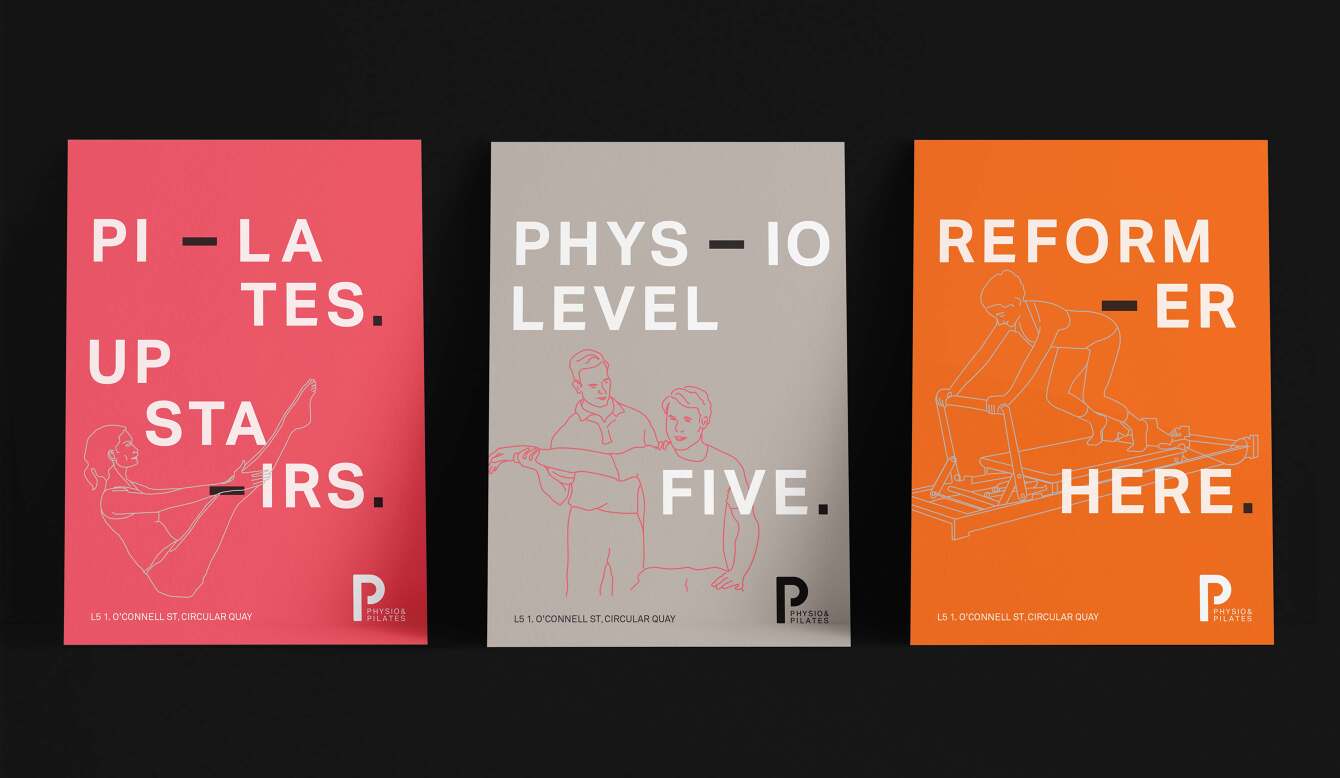
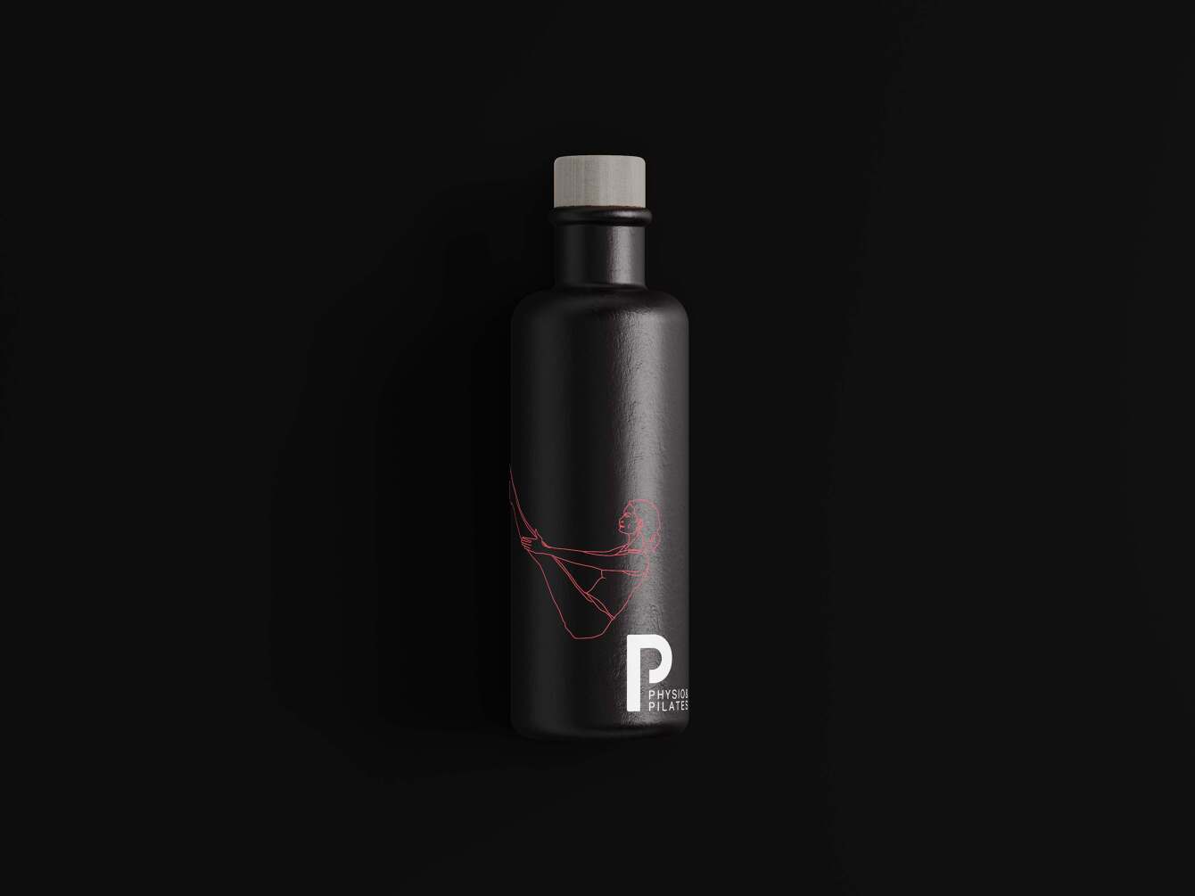
P&P approached me to assist them with developing their new logo and all associated material for their new location. The work was to identify with the high-end demographic they were aiming to attract.
The “P within a P” logo mark was created and was to represent that pilates and physio could be found in one studio. To stand out from the others a neutral grey and neon orange and red colour palette were used and intertwined with organic illustrated line drawings.
The “P within a P” logo mark was created and was to represent that pilates and physio could be found in one studio. To stand out from the others a neutral grey and neon orange and red colour palette were used and intertwined with organic illustrated line drawings.
Disciplines:
Brand & Identity Design / Brand Rollout / Illustration / Website Direction
Industry:
Wellness
Brand & Identity Design / Brand Rollout / Illustration / Website Direction
Industry:
Wellness