THE GREEN DOT
The Green Dot symbol is used by 130,000 companies, appearing on 460 billion packages every year and is regularly confused with the recycling symbol. It does not mean the product is recyclable and is causing widespread confusion, resulting in huge amounts of recycling contamination.
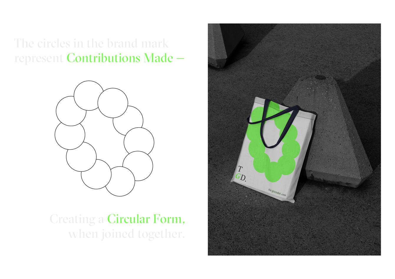
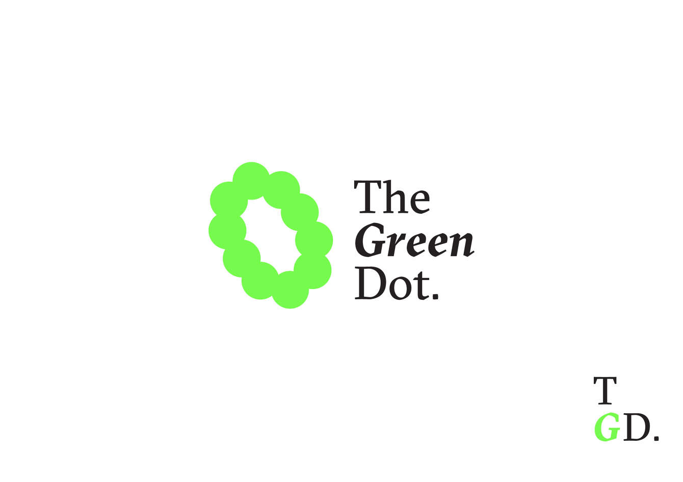
An ovalish brand mark was created and accompanied by a contemporary serif wordmark. The circles in the brandmark represent contributions made, these dots create a circular-like form when joined together. This shape was the basis for the brand’s playful design language.
Our brief to redesign the Green Dot symbol is a collaborative initiative with @thebrandidentity.
Disciplines:
Brand & Identity Design / Brand Roll Out
Industry:
Environment
Credits:
Featured, Two°Creative. online
Brand & Identity Design / Brand Roll Out
Industry:
Environment
Credits:
Featured, Two°Creative. online