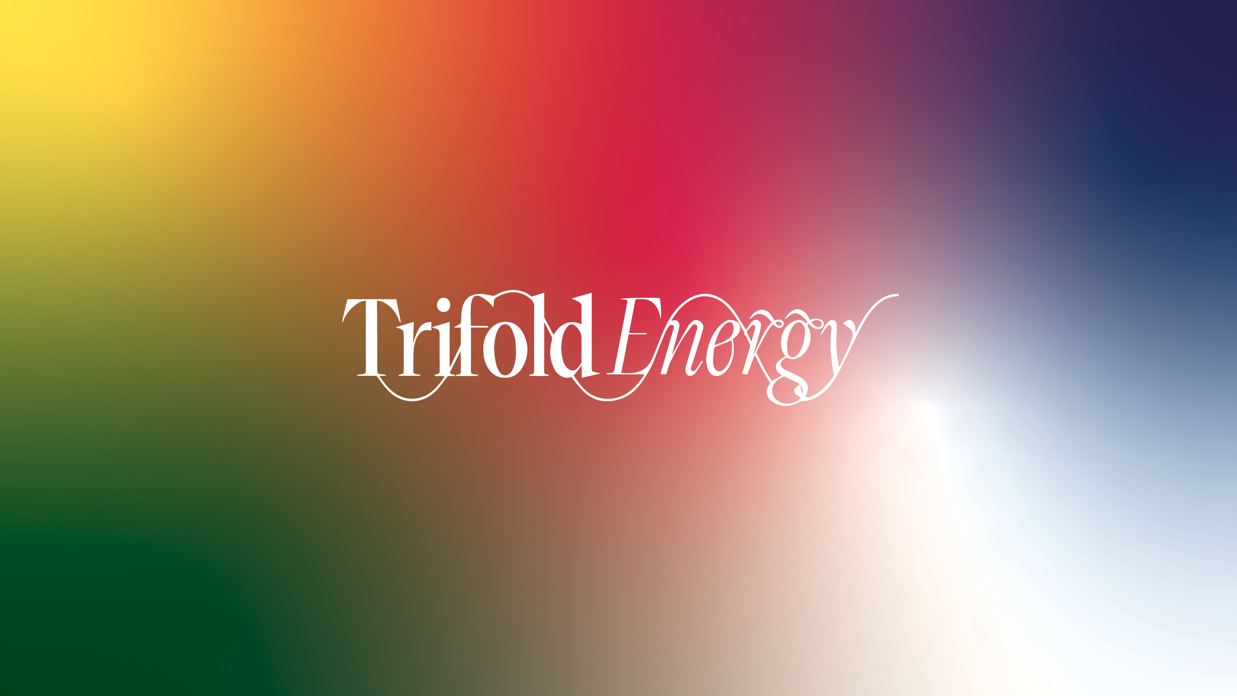
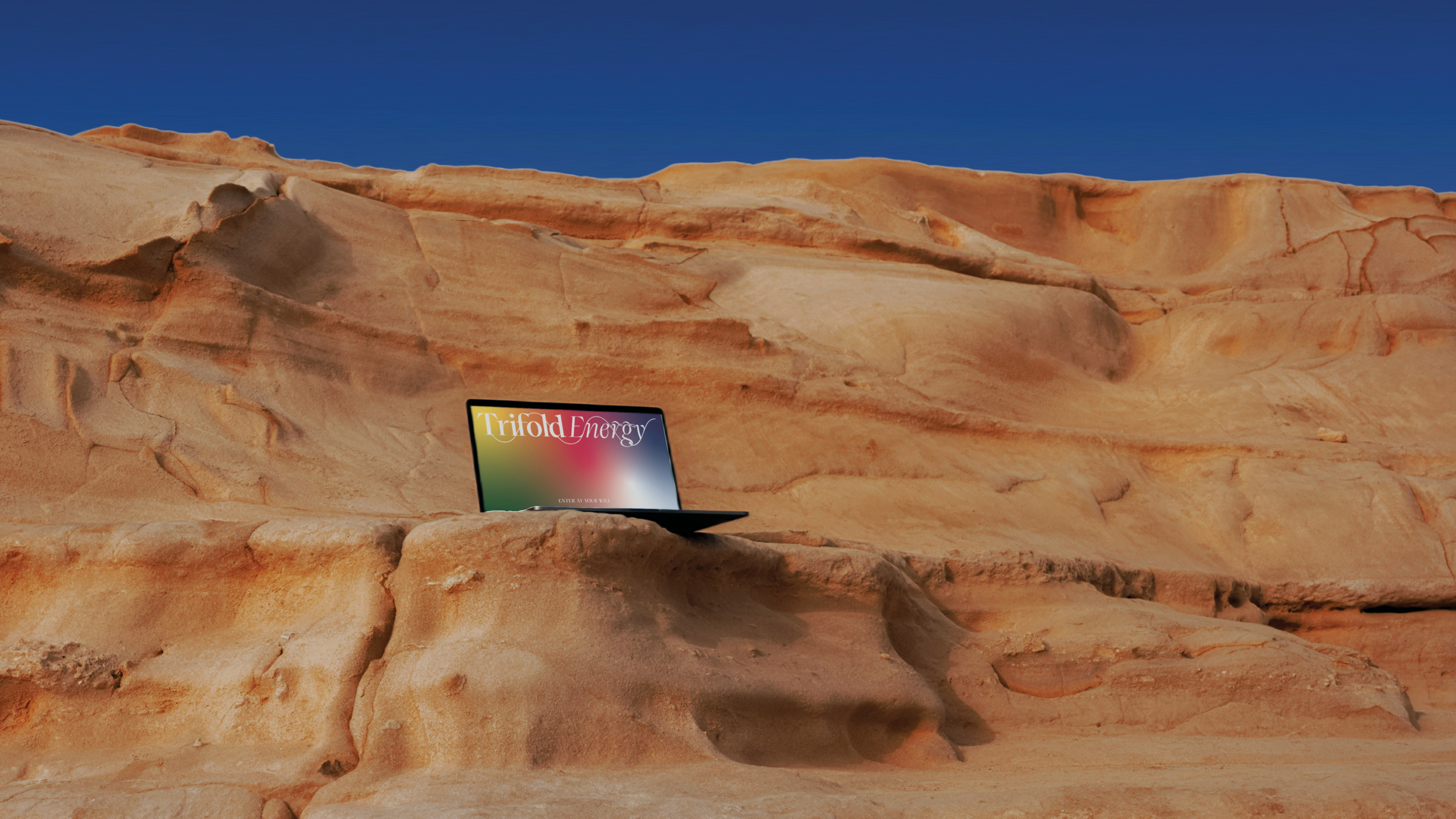
Trifold Energy
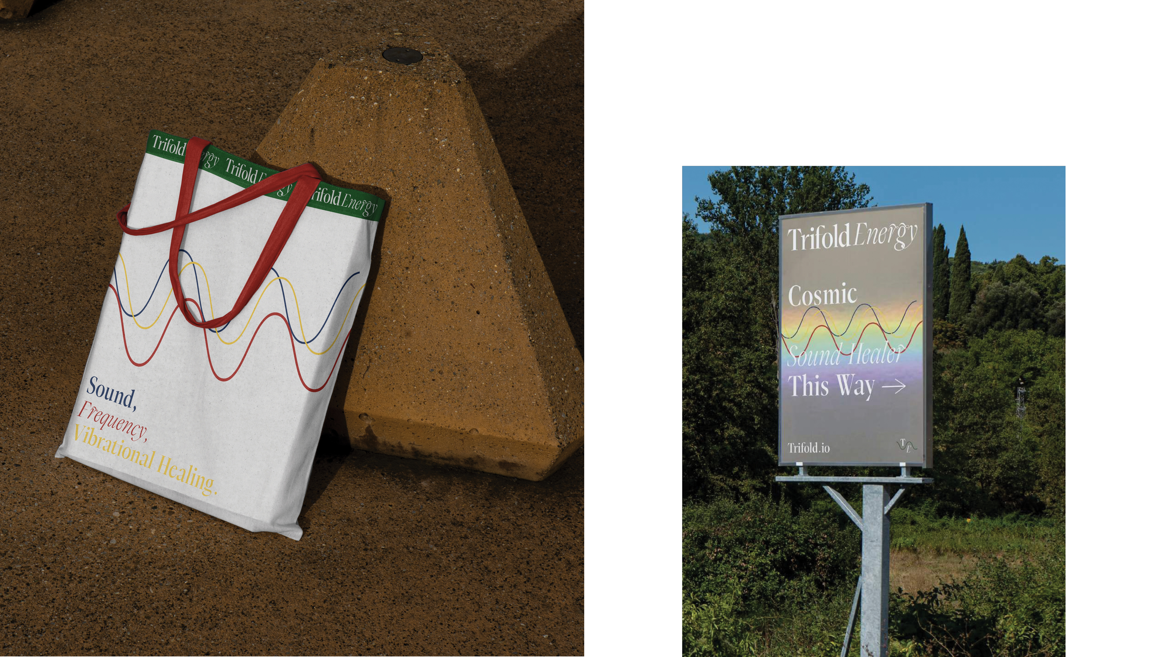
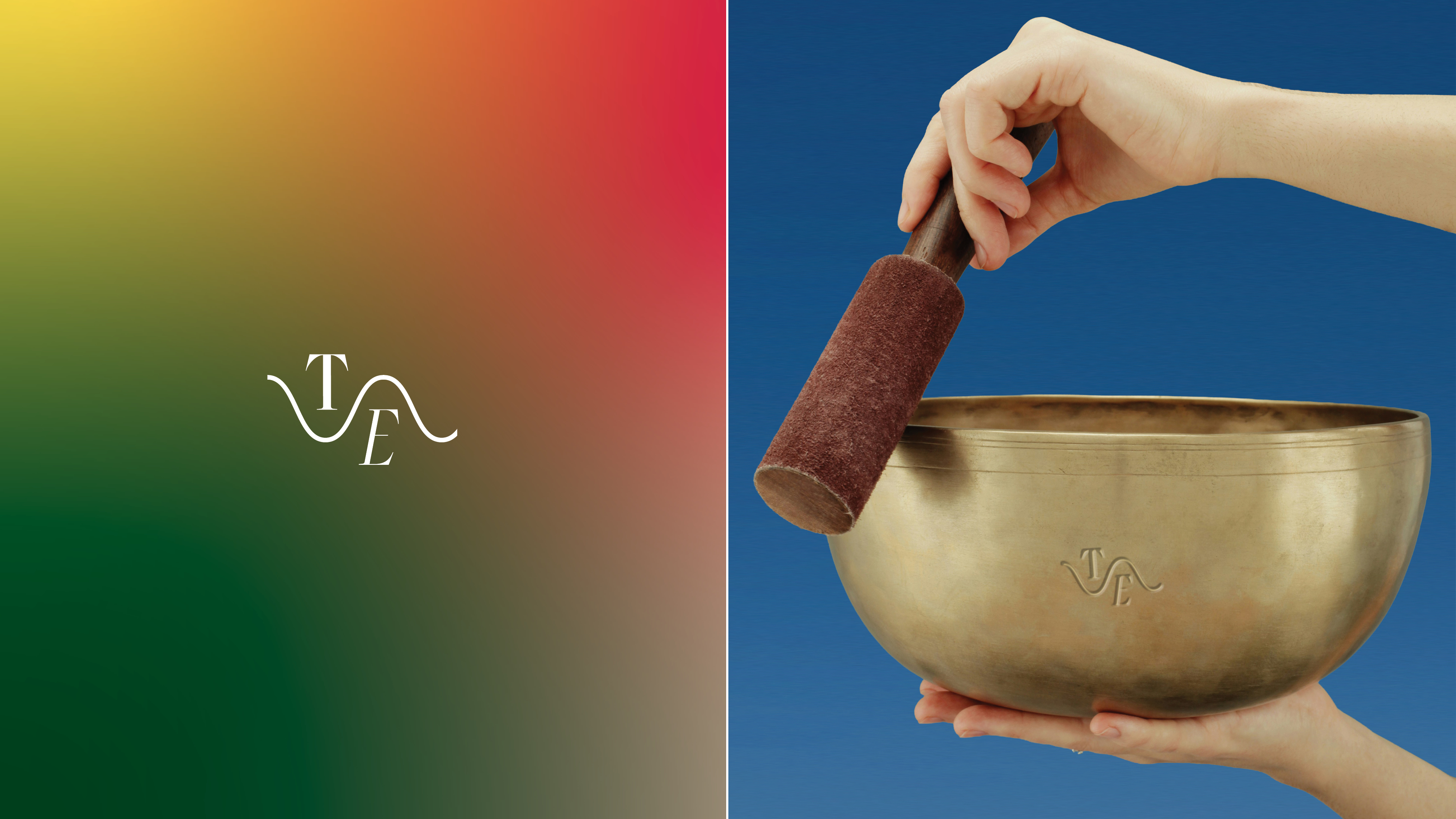
A unique wordmark was incorporated, featuring sound waves and mountain-like forms, visually representing the convergence of sound healing, place, and ancient practice.
The three lines in the brand’s design language not only represented Trifold, but each line also represented parts of the healing - ‘Sound, Frequency and Vibrational Healing.’ When used together, they become more than the sum of their parts - hence the name.
The Tibetan colour palette used is tied back to the roots of this ancient healing practice, while a holographic foil was added into the mix to speak for the cosmic nature of the healing.
Disciplines:
Art Direction / Brand & Identity Design / Brand Rollout / Creative Direction / Digital & Social Media / Website Direction & Development
Industry:
Wellness
Credits:
Art Direction / Brand & Identity Design / Brand Rollout / Creative Direction / Digital & Social Media / Website Direction & Development
Industry:
Wellness
Credits:
Featured Brand Work, Outstanding Branding